
Moleskine

Overview
In order for me and my team to discover what this product needs to rise above its competitors and retain its loyal users we wanted to familiarize ourselves with what already exists since none of us had ever used this product before. Fortunately, one of our team members found a Moleskine store near where he lives so he went in and tried it out and reported back to us.
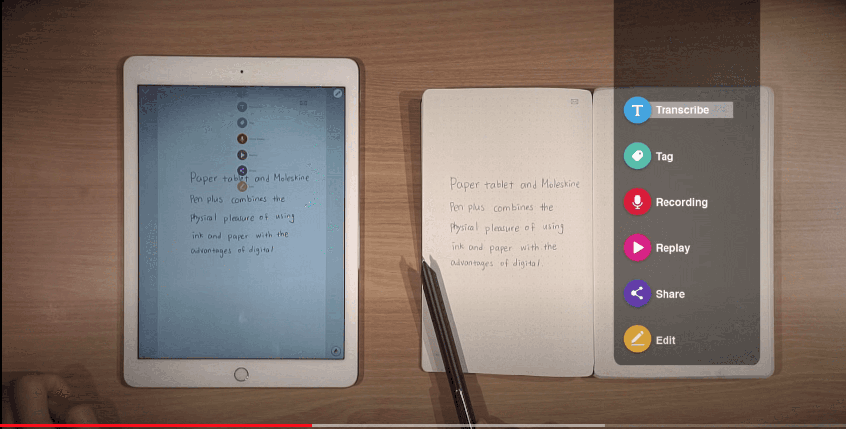
The Moleskine Smart writing system comes with a Smart Book, which has special infrared paper, a Smart Pen with real ink and an infrared camera, and a mobile and tablet app which uploads your images or notes through live sketch or remote syncing. Basically, you write or draw in the notebook and the writing or drawing appears live on your app in real time.
And so our interviews just focused on their behaviors and what their goals are when taking notes or drawing by hand. We synthesized our findings into two personas. Our primary persona is:
We synthesized our findings from our research into a concise and informative problem statement so we can identify the primary issue our interviewees had.
Ideated Solutions
Using what we had discovered in our research and synthesis we had a few ideas to maybe move forward with. One idea was:
To create a voice to transcript feature. It already has a voice recording function so we would expand on it to enhance accessibility. Another one was:
To revamp the current file organizational system to improve upon a weak feature and address efficiency issues.
Chosen Solution
All evidence and research pointed to a desktop app as the most useful solution. It addresses the fundamental misunderstandings of the user workflow. It has the ability to incorporate other useful features our team had considered. And not all the competitors have a desktop app which would put Moleskine ahead of the pack.
Game Plan
We identified a few features we wanted to keep for usability and familiarity purposes like the:
Live sketch function
Color Palette and font
Live syncing of sketches/notes
We wanted to implement these to our desktop app as well as incorporating some changes and updates based on our heuristic evaluation like
Inconsistent navigation system (vague labels)
Sync icon too small and confusing
Confusing organizational system
Site Maps
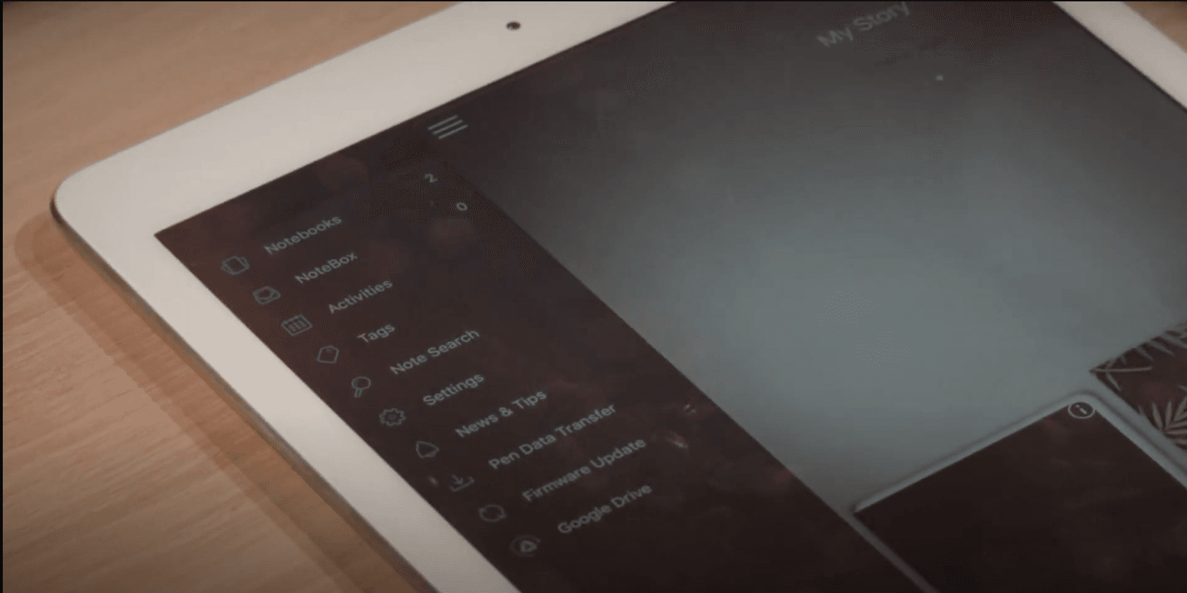
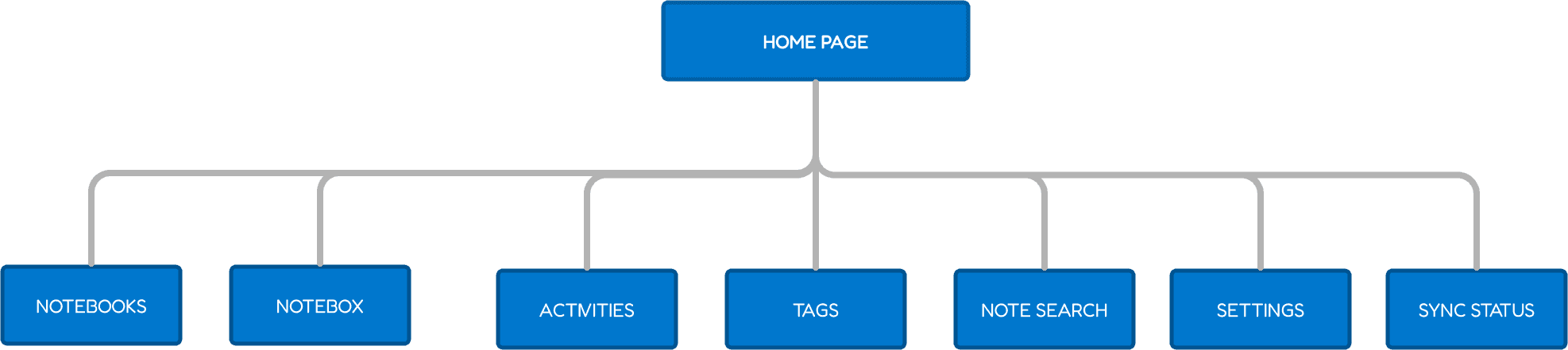
Because we were working with an app that already exists we made a retrospective site map in order to identify flow issues.
This is the organizational system as the mobile app stood before we began. There are some overlapping functions, redundancies, and a confusing path.
We wanted to focus on these usability issues going forward with our solution. We gathered our knowledge from research such as video tutorials and reviews since we didn’t have the actual product in front of us.
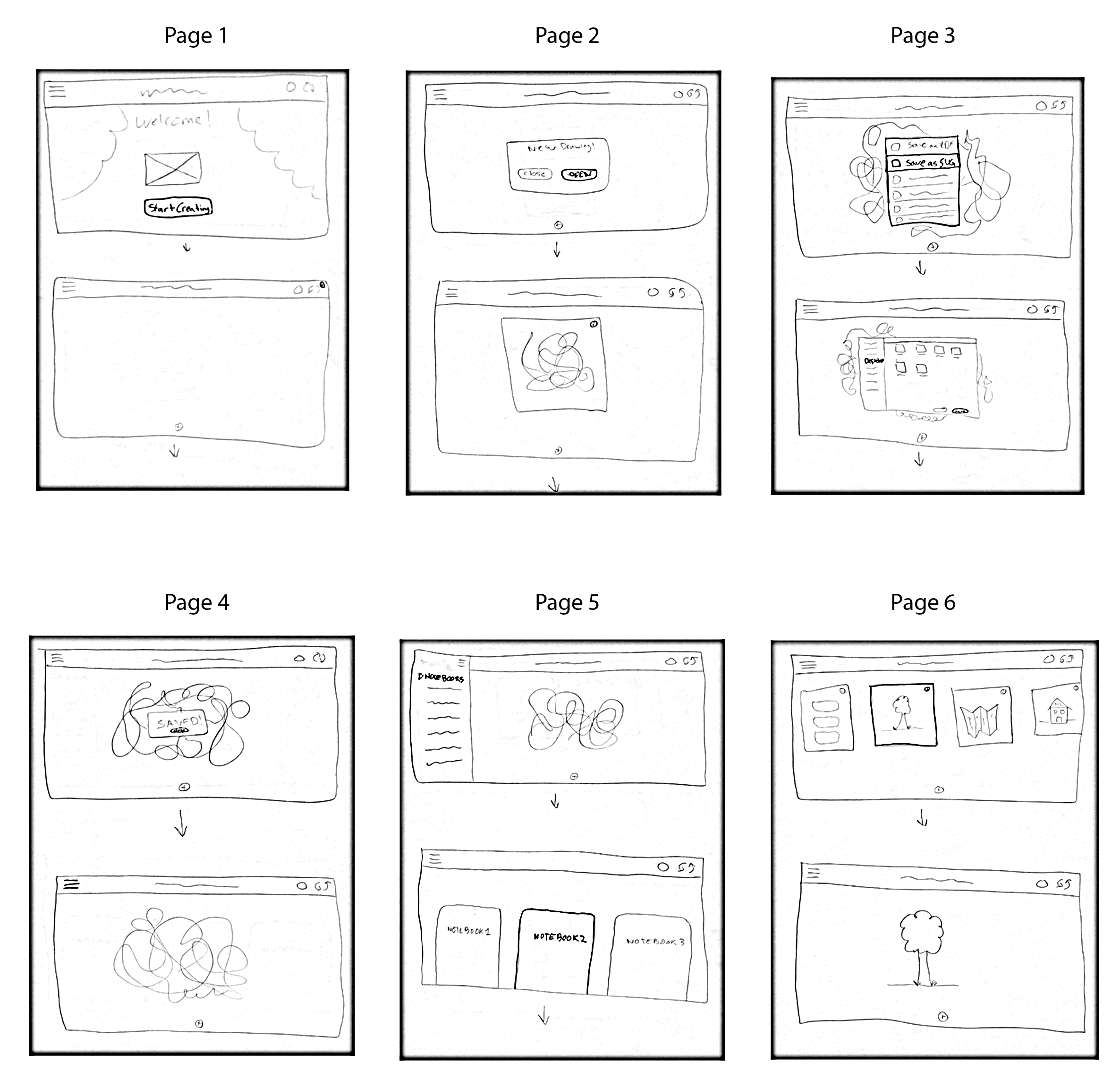
After some sketches, more analysis, and some iterations we came up with a projected version. It addresses the navigation pain points by moving items around and combining a few for a better flow.
First Iteration
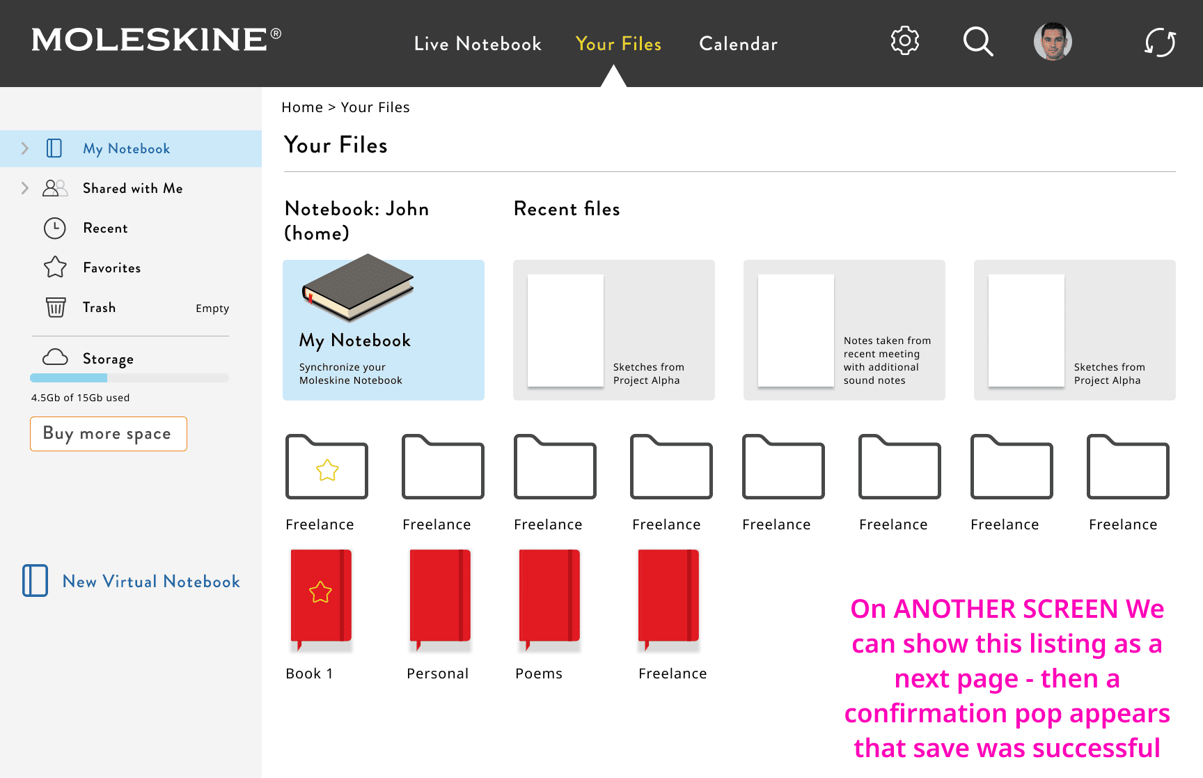
We knew a desktop app was going to be a good solution, but needed to decide on which solution to prototype. One iteration was to develop a new file saving and organization system to resemble something like Google Drive as users are already familiar to the layout and system.
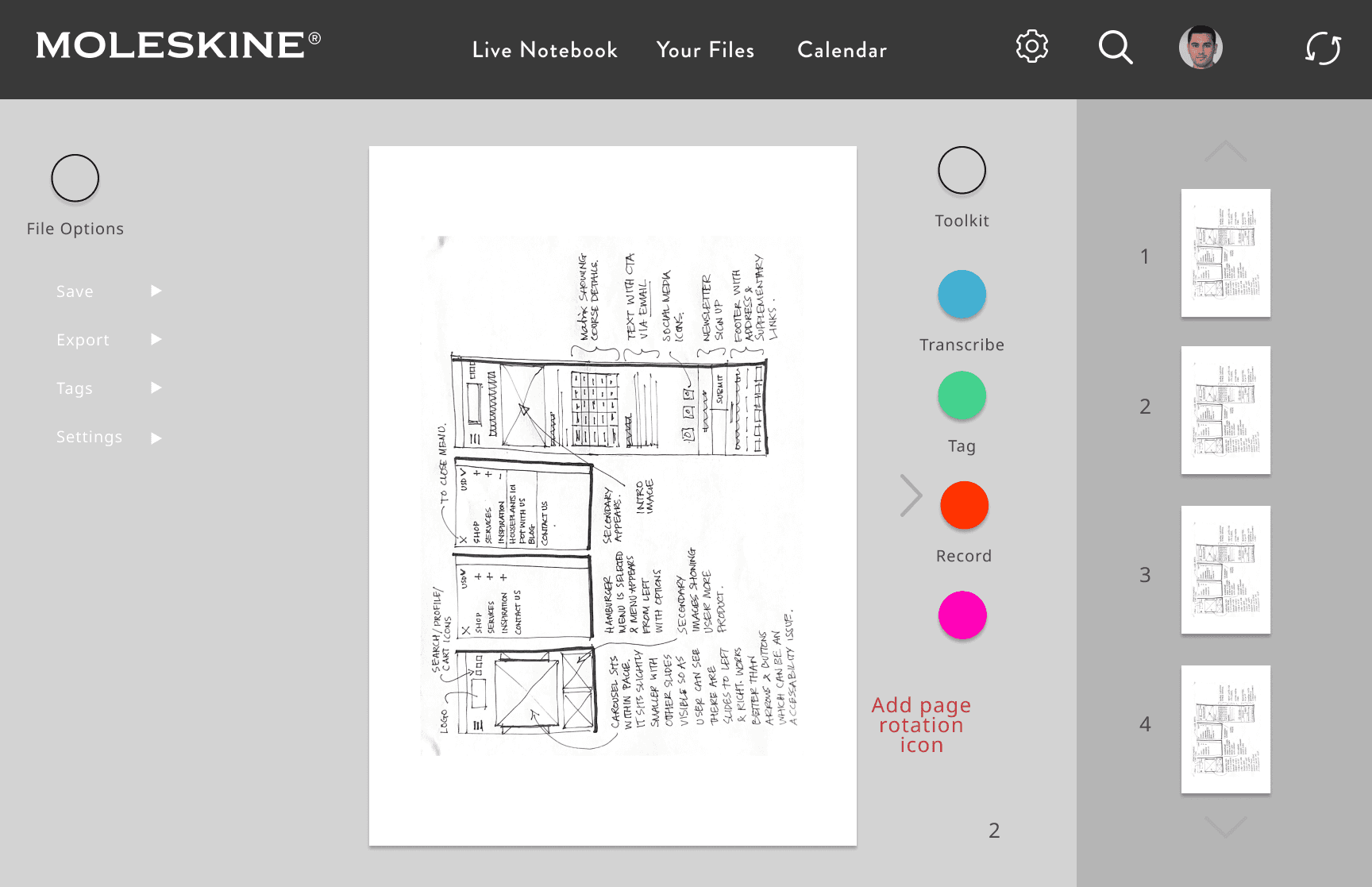
Another one, and one we decided to move forward prototyping, was more suited to our persona. We focused on the live sketch and a way to save the drawing on to the desktop as well as being able to share his screen on Zoom for pitch meetings or design studios. Our scenario for our solution is our persona has just returned to his office from sketching in a coffee shop and needs to continue to advance his idea on other apps such as Photoshop or Illustrator.
Prototype Video Demo
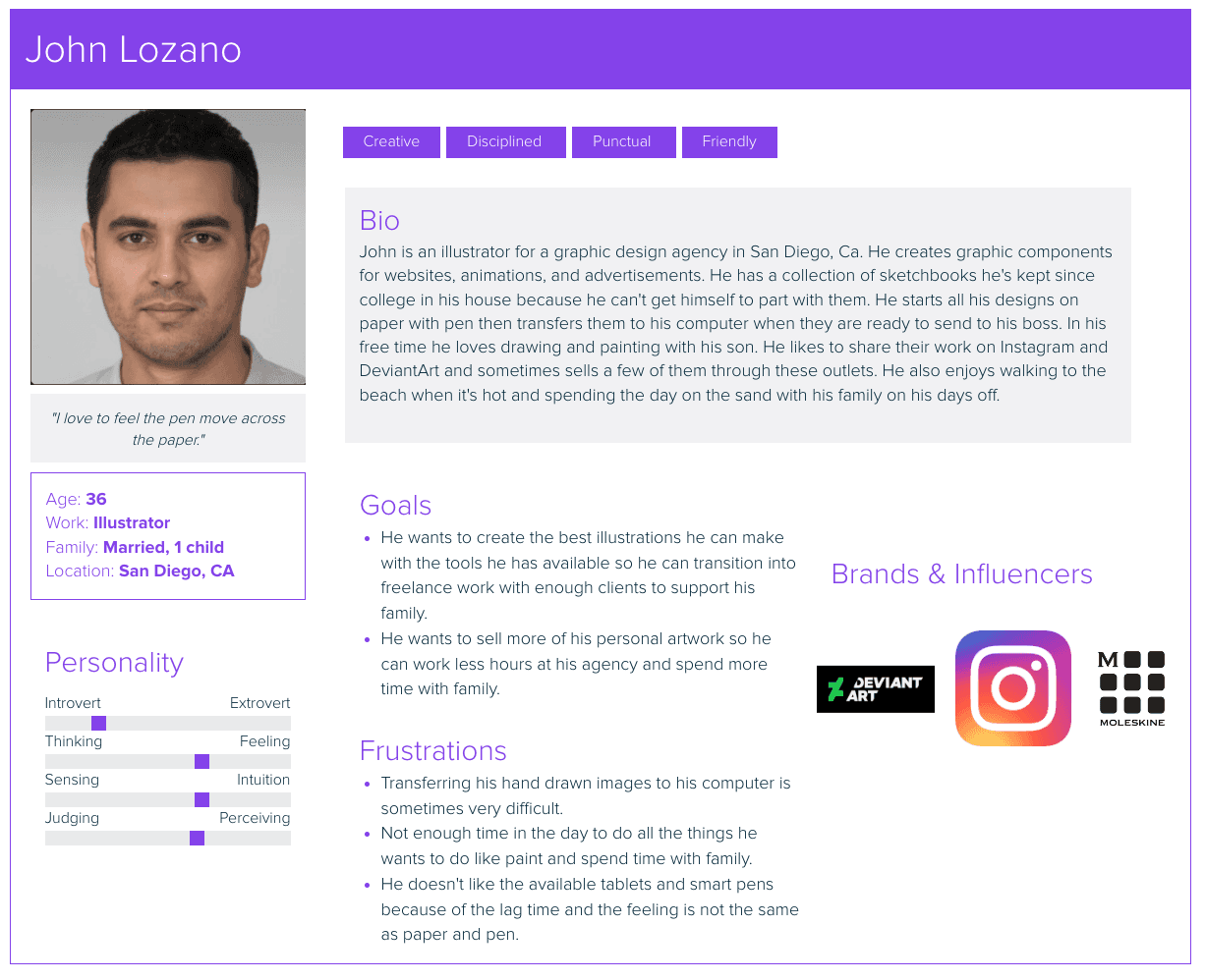
Our persona, John Lozano, needs a way to easily transfer his sketches from his notebook to his digital devices, because he wants to advance the design without interrupting the fluidity of his thought process.
Problem Statement
John’s Journey
“The faster I complete my job, the cheaper it is for my client.”
We found similar features using different methods of capturing the drawings/notes. All had a way to share your work on social media or to save in a drive service like Google drive.
To get the user’s perspective we interviewed artists, writers, architects, and note takers who used digital tablets or hand written notes. We didn’t have access to people who used the Moleskine Smart Writing System as it comes at a high price, but we identified these people as our target users because they would definitely benefit from using it.
Research
We wanted to see what Moleskine’s competitors have, as far as live sketching in an app goes, so we analyzed their weaknesses and strengths so we could identify what we thought was the essence of what was working and was lacking for its users.
We looked at:
GoodNotes app
Rocketbook
Remarkable 2


(a desktop app)
Testing
We wanted to know how effective our app was so we ran usability tests with three different participants to see if they could navigate our app. We asked them to complete two tasks:
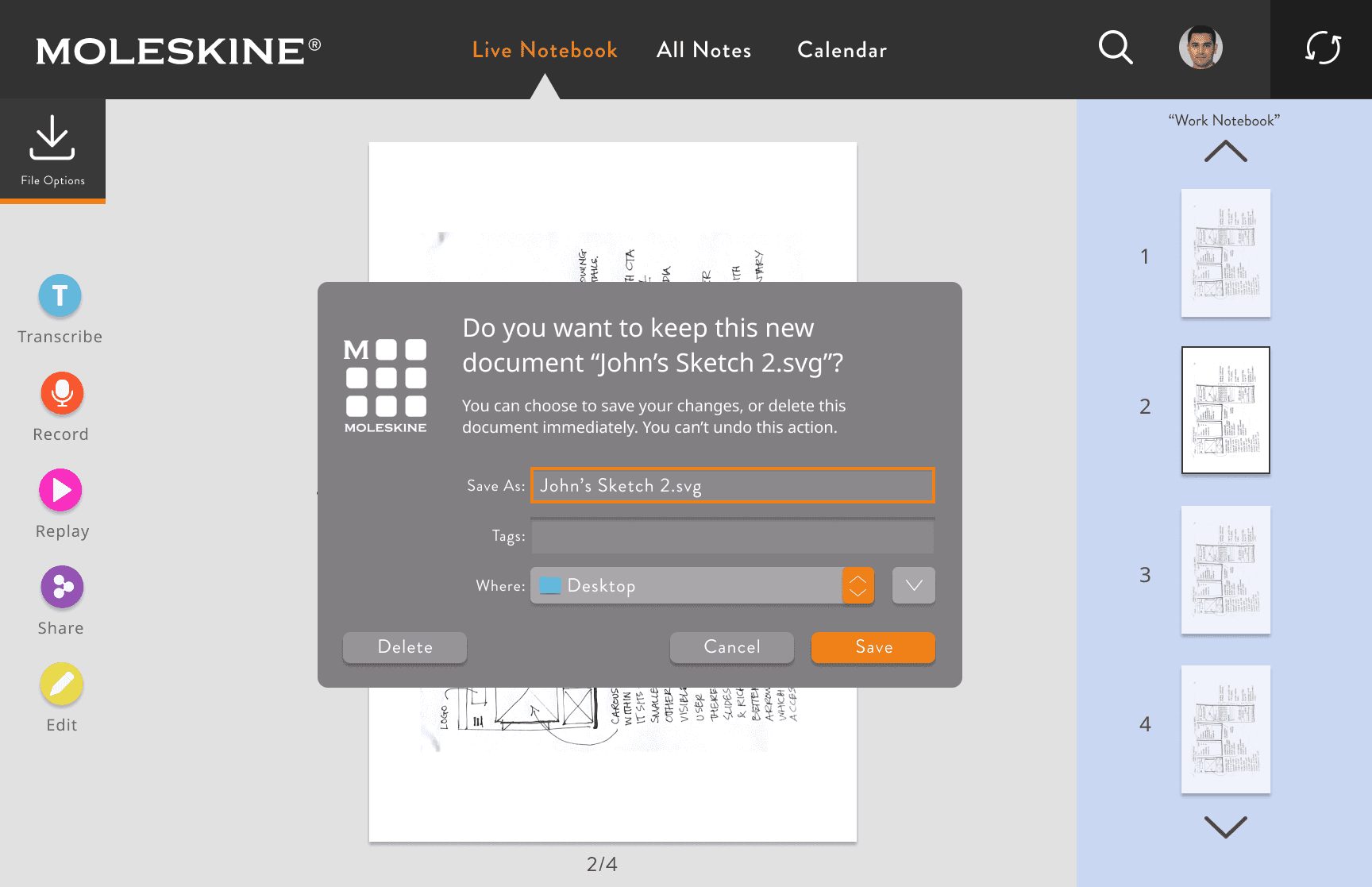
Task #1 was to locate and download a drawing in an SVG format onto the desktop.
Task #2 was to navigate and locate the “Sync Now” menu.
We found that 100% of them successfully completed task #1 without any issues, but only one of three participants were able to complete task #2.
Reflection
I was part of a team that consisted of three people from three different time zones and two continents. We came together (remotely) to develop and design this new desktop app for the Moleskine Smart Writing System. There were a few challenges we faced such as the time zone difference, and that this is an expensive and niche product two of us did not have in front of us to test. We overcame these with timely communication, a flexible but direct schedule, and strong collaboration. Over all this was very fascinating and has been a great source of creative inspiration that kept me driven throughout this project. I hope to work on more creative projects like this in the future.
Next Steps
The results of our testing pointed to some recommendations to consider in order to fully deliver what our users need:
Consider adding text description under the Sync icon
Flesh out an MVP with the implementation of
File organization
External hard drive integration
Explore sustainability enhancements to stay ahead of industry trends
See More Work
Wanna work together?
Reach out to me so we can begin working on your project.
Designed by Diego Barrientos
Landing Page
Save File to Desktop