Common Agency

Overview
My team and I were approached by Common Agency, a small company who runs a Neighborhood Network site that has opened in two cities, Metuchen, NJ and Eastcore, MI. After we were introduced to Common Agency, we understood that the organization’s mission is to build better communities; ones that are active and unified, through connecting neighbors to engage with one another
.
The website’s current way of doing that is by sending out weekly questions to members via text or email, in which they can reply and have those responses displayed on the website for other members to see, in hopes of making a connection.
Our client approached our team with the need to discover how the site’s usability and overall user experience could be improved. The problem she observed was that users weren’t very active on the website, and that maybe it was because the current site needed an additional feature or some kind of revamping.
Research
So to begin we needed to familiarize ourselves with the current networking site and onboarding process in order to find out what we need to address. A user would scan a QR code from a flier they got from a Common Agency booth at a farmers market or a block party. They would then be sent to a website to sign up. After that they would get a link emailed to them that takes the user to the Neighborhood Network where they can see other members from their neighborhood, respond to the question of the week and participate in the quest of the week.
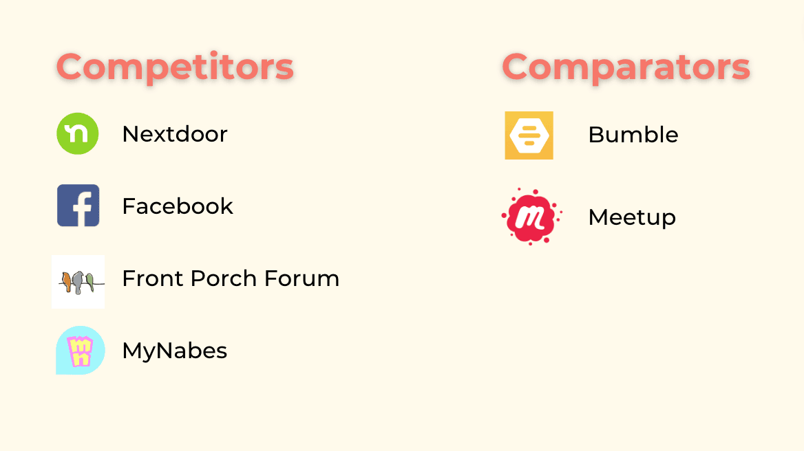
Competitors
Our client mentioned some of her competitors so we dove in to see how they worked. These are those and some we found from our own research.
Missed Opportunities
One feature that our website doesn’t currently have but the competitors have is the ability to respond, comment, and message within their sites. But there’s no vetting so it creates the negative and toxic environment we are avoiding. So how do we address that?
Another is a way for users to introduce themselves to each other. But there’s no way to ensure connections happen. How do we address this as well?
User Interviews
To help answer these questions we interviewed nine people who varied in technological proficiency, those that are active in their community, and those who keep to themselves. We wanted to understand how people interact with their community.
Key Findings
We collected our interview notes and worked together to create an affinity map in order to find patterns, themes, and pain points in all the data. Some common themes we found that we wanted to focus on are:
Having a place to share information and group events make people feel included, like they’re a part of something.
Knowing the interests and lifestyle of a person are important things to consider when deciding to pursue a connection with someone.
It can be difficult taking the first step of introducing yourself to a neighbor, and many find it unnecessary when they already have existing social circles.
Pain Points
Some of those pain points that we focused on were:
There’s an unhealthy addiction to being negative on neighborhood apps that are available.
Issues with social anxiety
Some neighbors tend to keep to themselves.
Which is important to note because during our first zoom call with Deborah, she mentioned: “It’s too early for a success story but to have the people who are shy be able to share would definitely be one.”
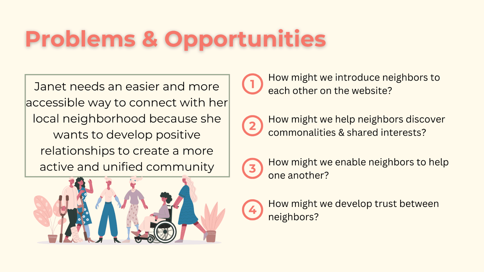
Personas
We synthesized our findings into two personas. Our primary persona is Janet De La Cruz. She represents the active members of the community that we interviewed. Janet:
Problem Statement
We used all this data to condense it down to a problem statement:
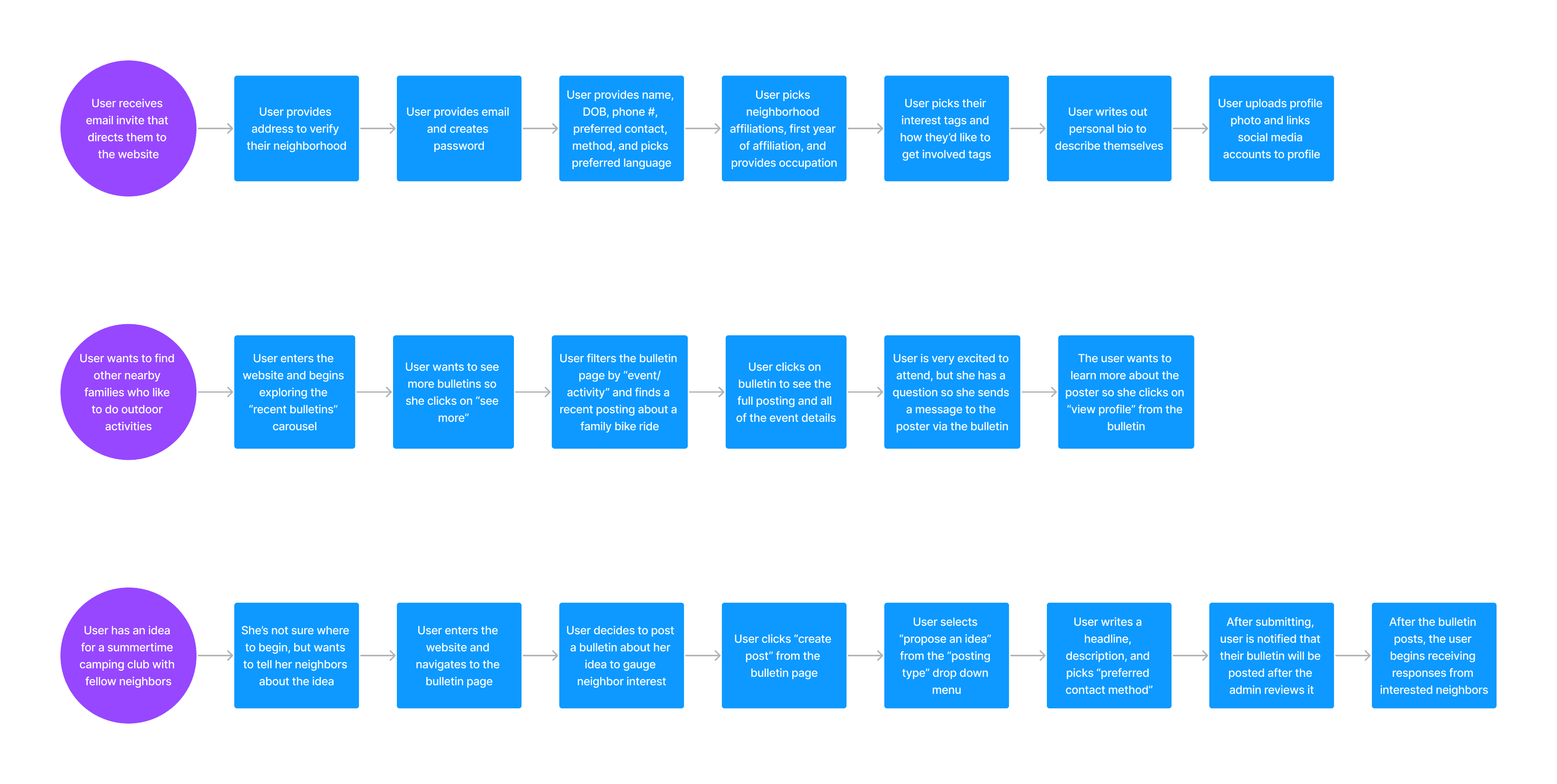
User Flows
Our next step was to create user flows in order to develop each step of the user journey for different tasks.
Prototype Video Demo
Design Studio
Our team began the design phase by doing a design studio together. This is an interactive exercise where we quickly draw out sketches during 10 minute intervals. After each round, we would present our sketches to each other, combine our favorite designs, and iterate again and again.
We had several goals in mind during the design studio:
Firstly, we wanted to design an intuitive onboarding experience that collects relevant information and ensures the website directory will help neighbors get to know each other and encourage connection.
Secondly, we wanted to improve the existing layout of the questions and answers section of the website to make it easier to read and more interactive for the user.
Thirdly, we wanted to develop a new feature that encourages neighbors to be more active and involved in their community by bonding over shared interests and skills.
The first user flow we created was based around each step of the onboarding experience, what user information we wanted to collect, and how we wanted to divide up that information on the different onboarding screens.
The second and third user flow were based around our new Bulletin Board feature and shows how a user would discover a local event or activity and interact with that bulletin posting.
The third flow shows how a user would create their own bulletin posting to propose an idea to the neighborhood.
We quickly turned these user flows into wireframes, which we then developed into a high-fidelity, working prototype.
This addresses the need we found in our research while our top HMW’s here on the right helped us begin to ideate and imagine new solutions.
Wants to create a positive and engaging community so she can feel safe, included, and supported.
Wants to live in a neighborhood where people share ideas, skills, and assistance so she can enjoy her time at home when she’s not working or away on a family trip.
But some of her frustrations are:
It’s difficult for Janet to make friends in her community because some people are reluctant to interact in person
The current network she is part of focuses too much on negative topics and is just a depository for complaints that most community groups tend to be.
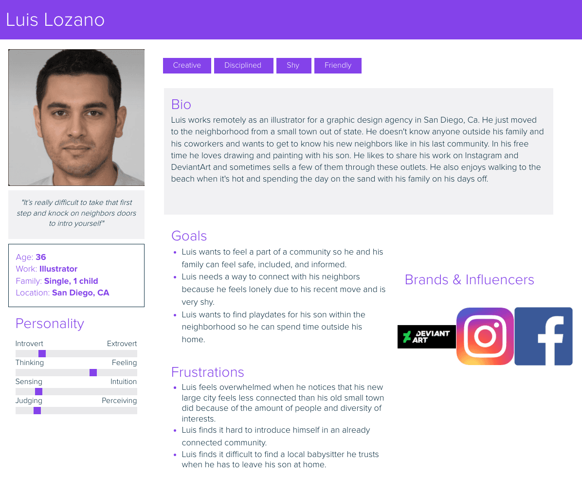
Then there’s Luis Lozano who represents the neighbors who keep to themselves due to shyness or awkwardness. He:
Needs a way to connect with his neighbors because he feels lonely due to his recent move and is very shy.
Wants to find playdates for his son within the neighborhood so he can spend time outside his home.
But:
Feels overwhelmed when he notices that his new large city feels less connected than his old small town did because of the amount of people and diversity of interests.
Finds it difficult to find a local babysitter he trusts when he has to leave his son at home.
We included Bumble and Meetup because although they are not neighborhood apps, they do connect people. Keeping a positive environment was one of the main aspects our client wants to differentiate herself from her competitors and we found that most of these have negativity as their main critique.
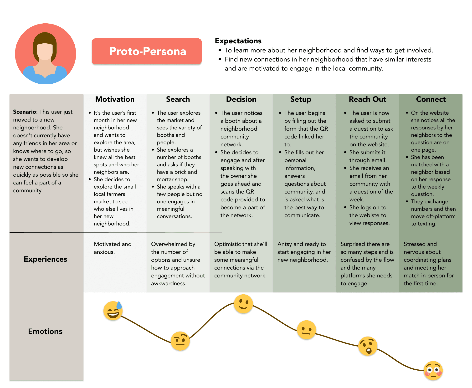
We created a journey map in order to document how a new member would go about signing up and how they feel during the process. The emotional response section captures some of the violations we found from our heuristic analysis:
Onboarding is done on a separate site
No incentive to connect with other users
To add a response to the feature: Question or Quest you have to text/email


Current “Questions and Responses” page
Current “Profile” page


(a social network)
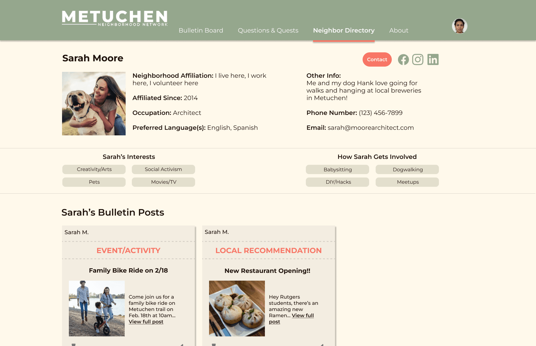
Profile Page
Bulletin Board
Wanna work together?
Reach out to me so we can begin working on your project.
Designed by Diego Barrientos
Reflection
I worked with a fantastic team on this fun project. We spanned two time zones, but overcame the challenge by prompt communication through slack and zoom, and through strong collaboration. Over all this was very fascinating and has been a great source of creative inspiration that kept me driven throughout this project. I hope to work on more creative projects like this in the future.
Testing
We conducted 5 usability tests, which yielded positive results. All 5 testers successfully completed the onboarding, discovered and interacted with a relevant bulletin post, and then successfully created a bulletin post. We also found several opportunities for improvement based on our testing feedback.
We made several minor UI changes to make things easier to read.
We then changed the phrasing in the onboarding experience when we ask users “what they can help with” to “how can they get involved” in order to make it feel less demanding and more inviting.
We also added an admin review step for the question and quest responses on the website so that content can be evaluated before going live.
See More Work